Hand hygiene is generally considered a safe and simple intervention to decrease the spreading of microorganisms, but complete compliance by healthcare providers is not 100%. Healthcare facilities are encouraged to have a monitoring system to measure compliance, and to provide feedback based on those results. Sounds like a simple proposition, but as many things in life, it’s easy to say than done. At the most basic level, a hand hygiene monitoring program should be able to show compliance rates (number of actions divided by number of opportunities), and to “slice and dice” the data by location, date and time, and type of healthcare worker, among other variables. At this time, the majority of programs use direct (or “manual”) observation of these opportunities for hand hygiene. Even though electronic monitoring might be able to capture a larger number of potential opportunities, compared to human observers, these systems are not widely deployed. It is still expected for an infection prevention program to perform data collection, analysis, visualization, and feedback. Some solutions in the market will give some basic analytic capabilities, after you enter the observations, and it will generate some basic analytical reports, including dashboard report creation.
Because I am a believer of owning your data, I always ask whether you can download the data you are entering. With this in mind, and maybe wondering whether using open-source solutions can provide a solution akin to commercially available software (Tableau, TST, others), I started playing with a mock-up data set containing manual observations. After importing the data set (Microsoft Excel format) into R, you can perform some “quick and dirty” analysis, including the creation of simple charts.
In R Studio, you can import the XLS file from File>Import Dataset>From Excel:
library(readxl)
HHM_MockUp_Data <- read_excel ("~/path/to/file.xls", col_types = c("type_of_data_1", "type_of_data_2")
For this exercise, the imported fields are date/time of observation, type of healthcare worker, name of observer, type of hand hygiene (soap and water, alcohol-based rub, none), moment of hand hygiene (entry or exit), adherence (1 = yes, 0 = no), and location. I assume you have either think about how to save your data to avoid "data wrangling”, or that you had to clean your data (the most likely problem…it will take a while). Let’s say you want to know the overall compliance rate and save it in a variable:
overall_avg <- mean(HHM_MockUp_Data$Adherence)
In my case, the result would be:
> overall_avg
[1] 0.8797977
You can build basic tables, like the number of observation by type of product:
> table(HHM_MockUp_Data$`Observed Hand Hygiene`)
   Alcohol rub   Did not wash Soap and water
          8389           1569           3095
Or better, using CrossTable for additional data (you will need to install and load the Gmodels package, either in the console, or in R Studio at Tools>Install Packages). This will give tables similar to S-Plus crosstabs() and SASProc Freq (or SPSS format) with Chi-square, Fisher and McNemar tests of the independence of alltable factors.:
install.packages(gmodels)
library(gmodels)
> CrossTable(HHM_MockUp_Data$Observation)


   Cell Contents
|-------------------------|
|                       N |
|         N / Table Total |
|-------------------------|


Total Observations in Table:  13053


          |     Entry |      Exit |
          |-----------|-----------|
          |      6598 |      6455 |
          |     0.505 |     0.495 |
          |-----------|-----------|

> CrossTable(HHM_MockUp_Data$Observation, HHM_MockUp_Data$Adherence)

   Cell Contents
|-------------------------|
|                       N |
| Chi-square contribution |
|           N / Row Total |
|           N / Col Total |
|         N / Table Total |
|-------------------------|


Total Observations in Table:  13053


                            | HHM_MockUp_Data$Adherence
HHM_MockUp_Data$Observation |         0 |         1 | Row Total |
----------------------------|-----------|-----------|-----------|
                      Entry |       870 |      5728 |      6598 |
                            |     7.457 |     1.019 |           |
                            |     0.132 |     0.868 |     0.505 |
                            |     0.554 |     0.499 |           |
                            |     0.067 |     0.439 |           |
----------------------------|-----------|-----------|-----------|
                       Exit |       699 |      5756 |      6455 |
                            |     7.623 |     1.041 |           |
                            |     0.108 |     0.892 |     0.495 |
                            |     0.446 |     0.501 |           |
                            |     0.054 |     0.441 |           |
----------------------------|-----------|-----------|-----------|
               Column Total |      1569 |     11484 |     13053 |
                            |     0.120 |     0.880 |           |
----------------------------|-----------|-----------|-----------|
Even though tables are a valid way to present data (and it might be the best way, depending on the circumstances), chart creation is the sort of thing everyone expect when reporting hand hygiene compliance. For example, let’s say you want to show the number of observations by type of product (I have exported the plot as a png file for this purpose; higher quality formats are supported):
barplot(table(HHM_MockUp_Data$`Observed Hand Hygiene'))

The graphs are by all measures rather plain, and the syntax can get complicated if you want to add titles, legends, attribute labels (like “Yes” if adherence is 1, and “No” if Adherence is 0), showing horizontal rather than vertical bars, and other nuisances. This would be one of the big advantages of using Tableau, or other data visualization programs, where many of those decisions are taken by the program, and you can tweak many of them with “click and drag” commands. For example, this will be a simple (and bad) graph showing adherence by type of provider:
barplot(table(HHM_MockUp_Data$Adherence, HHM_MockUp_Data$Unit))
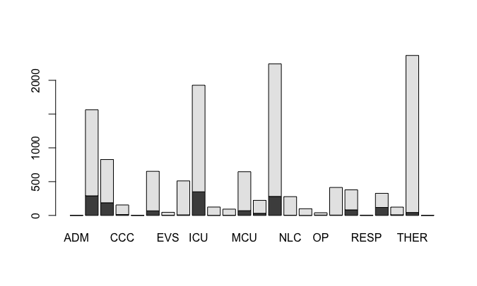
Look at the lack of a title, subtitles, lack of x and y axis legends, missing unit names, lack of information about the “colors” (black means no compliance, gray means compliance), using absolute observations instead of compliance rates, among others.
For the next entry, I will try to beautify some of the basic charts by delving into the syntax to bring the graphs to life, and using ggplot2 as an alternative solution.